Graphs and Charts can be added to your website. The data for these charts is normally driven by
database contents. An example would be 'sales over time'. Many different chart and graph types are available.
Check out the website below to see what can be accomplished on these web pages.
This example uses a technology known as AJAX. This technology allows for a very quick response time when changing
the controls and modes of the charts and graphs.
|
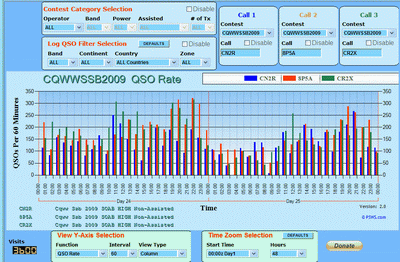
After clicking on the chart, you will be taken to the actual logqso.com website.
Click on the textbox with CN2R in the 'Call 1' control group. You will see a dropdown tabbed menu.
Try Clicking on any other item on the visible tab, or select another tab. The chart will
update with the data for the item you selected.
Change the 'Time Zoom Selection ' green shaded control to change the horizontal time scale or the
sampling interval
|
Logqso.com Web Application Chart
(click on image for interactive demo)
|
 |
|
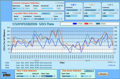
After clicking on the chart, you will be taken to the actual logqso.com website.
To display the graph shown on the right.
Locate the 'View Y-Axis Selection' green shaded control: Change the 'View Type' to
Spline.
Try changing the sampling interval with the 'Interval' dropdown selector.
|
Logqso.com Web Application Graph
(click on image for interactive demo)
|
 |